«Automated journalism» at scale
Learn how we've built an automated system to craft personalized, municipality-specific stories, boosting reader engagement one article at a time.

I've been a part of Tamedia for a little over three years now. During this period, aside from a few tweets and LinkedIn posts here and there, as well as sporadic presentations at conferences and webinars, I've been fairly quiet about my role and responsibilities. However, as I'm soon off to a three-month sabbatical holiday, I'd like to provide some insight into my day-to-day duties as the Head of Newsroom Automation at a mid-sized Swiss publisher.
Broadly, my role involves leading a small group of journalists and engineers, while also getting my hands dirty (i.e. coding) on a regular basis (luckily!). Our aim is to get our newsrooms to make the most out of technology and automation. For example, we automate Datawrapper charts, we scrape municipal websites & official gazettes for new information, or we create Slack bots that inform our journalists about new data sets and articles published by our competitors.
And, yes, the excitement around generative AI hasn't missed us. So, a fair bit of my work nowadays includes designing, implementing, and testing prototypes for editorial workflows that use the latest large language models. I might write more about this in a separate blog post when I'm back from my holiday (since everything I'd write about generative AI now will then be outdated anyway).
Personalizing the news through rule-based automation
Actually, much of my work in recent years has not been dominated by self-learning algorithms. Instead, it's been centered on what might have been termed an expert system or a rule-based AI a few decades back. Simply put, such a system takes spreadsheet data, applies some human-defined rules to it, and often ends up generating a simple text comprising a few paragraphs.
Data + Rules = Text (or charts)
The application of such systems in media is commonly referred to as «automated journalism», but I have some problems with that term and I'll tell you why in a bit.
Tamedia has been experimenting with this kind of automation since 2018. We've typically used it for coverage of national, cantonal, and municipal votes, as well as elections.

One of the early projects also involved automating soccer reports for lower leagues, although that initiative has since been phased out.

Over the past couple of years, one of my primary pursuits has been building a helper system (essentially a headless CMS) capable of producing these types of stories at scale.
When the topic of «automated journalism» comes up, people often picture sports results, election coverage, financial reports, and other areas that regularly churn out well-structured data sets.
But consider this: Any type of data set, if it's published at a granular and customizable level, can be transformed into a personalized story. In my opinion, the best type of customizable story is the one that focuses on the municipal level. Everyone lives in some municipality (as the lowest political organization form) and most people are keen to see how it compares with its neighbours and the country as a whole.
Fortunately, in Switzerland (and many other countries), there are plenty of intriguing data sets available at this level of detail. These can come from governmental sources like the office of statistics, or they might be provided by private companies to journalists.
Automating «automated journalism»
So, over the past few years, we've published personalized stories on a range of topics, from taxes and debt, to electricity tariffs and house prices (yes, stories involving money do tend to perform well). Each of these stories offers readers a data-driven glimpse of their own municipality.
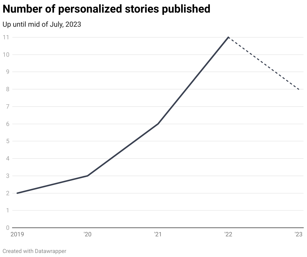
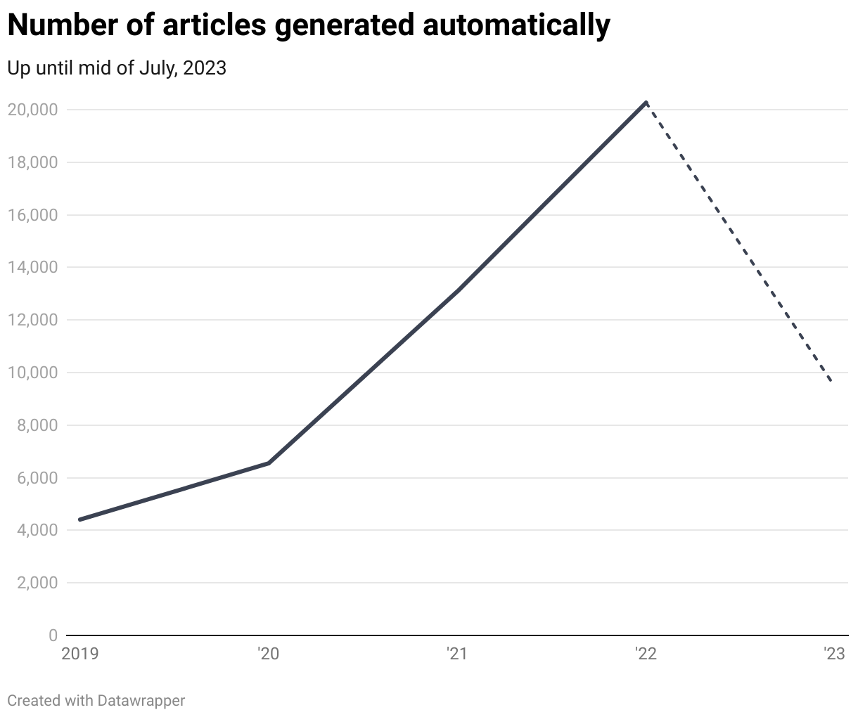
As it turns out, each year since we began this endeavor, we've published an increasing number of these personalized stories. The format remains consistent. Users first receive a brief introduction to the topic, after which they can select their specific municipality. Once selected, a paragraph containing the rule-based text is added. On occasion, we also include other elements, such as charts generated through the Datawrapper API or maps.

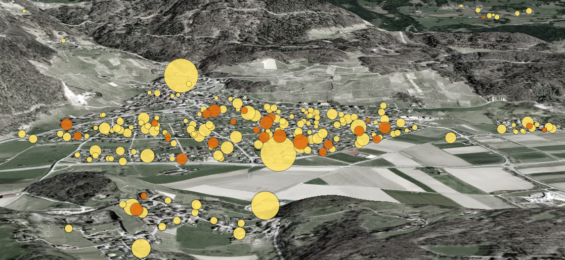
Here are some examples of Datawrapper charts that were generated for every municipality:

Considering that Switzerland has just over 2000 municipalities, and we frequently publish articles in both French and German, we wind up generating several thousand of these articles annually.
The system we've developed enables us to accomplish this at scale: the effort required to publish a story is boiled down to cleaning up the raw data and writing the rules for the text template. A REST API (built with Flask), which is the central component of the system, assists our journalists in adding various forms of municipality and inhabitant names in multiple languages. It then facilitates the generation of texts and their storage in a central database, from where they're delivered to our frontends.
A source of long-tail traffic
Our system also takes care of distribution. At the point of publication, a personalized teaser for each municipality is automatically added to our municipality pages, where automated stories mingle with «conventional» reporting.

It goes without saying that we also manage the harmonization of the so-called «municipality states». As you can see in the example above, one teaser appears to be duplicated (the one with the heatmap on the second and third positions).
This happens because this particular story utilizes a data set that references the municipality state of 2022 (rather than 2023). Back in 2022, the municipality of «Andelfingen» was actually two separate municipalities, «Adlikon bei Andelfingen» and «Humlikon», which merged in 2023. When users visit the page of the now united «Andelfingen», they also see the personalized versions of every past municipality state.
These municipality pages play a crucial role in driving what's called long-tail traffic. They enable our readers to discover stories even after they've disappeared from the front page of our newspapers.
Automating journalism? I doubt it!
To cut a long story short: Thanks to a bit of Python deployed to the cloud, we've succeeded in drastically simplifying the publication pipeline from raw tabular data to a personalized story. The extra effort required to personalize, or «municipalize» as we like to call it, a data-driven story is reduced to just a few hours of creating a text template, even if it's only for the teasers (title and lead). And our data indicates that it's absolutely worth it: These types of stories generate a level of engagement that's far beyond the average. Add to that the long-tail traffic that continues to trickle in over the following months.
But: we aren't automating the actual journalism, meaning the selection of data we want to report on, or the choice of sentences that appear in our generated texts. These are fundamentally human tasks, and they'll remain that way. What we're essentially automating is personalization. That's why I believe the term «automated journalism» can be somewhat misleading.
Do you have questions or want to implement something similar at your news outlet? Don't hesitate to contact me.