Categorical spatial interpolation with R
In this blog post, I show how to easily produce a categorical spatial interpolation from a set of georeferenced points – only using the tidyverse, sf and the package kknn.

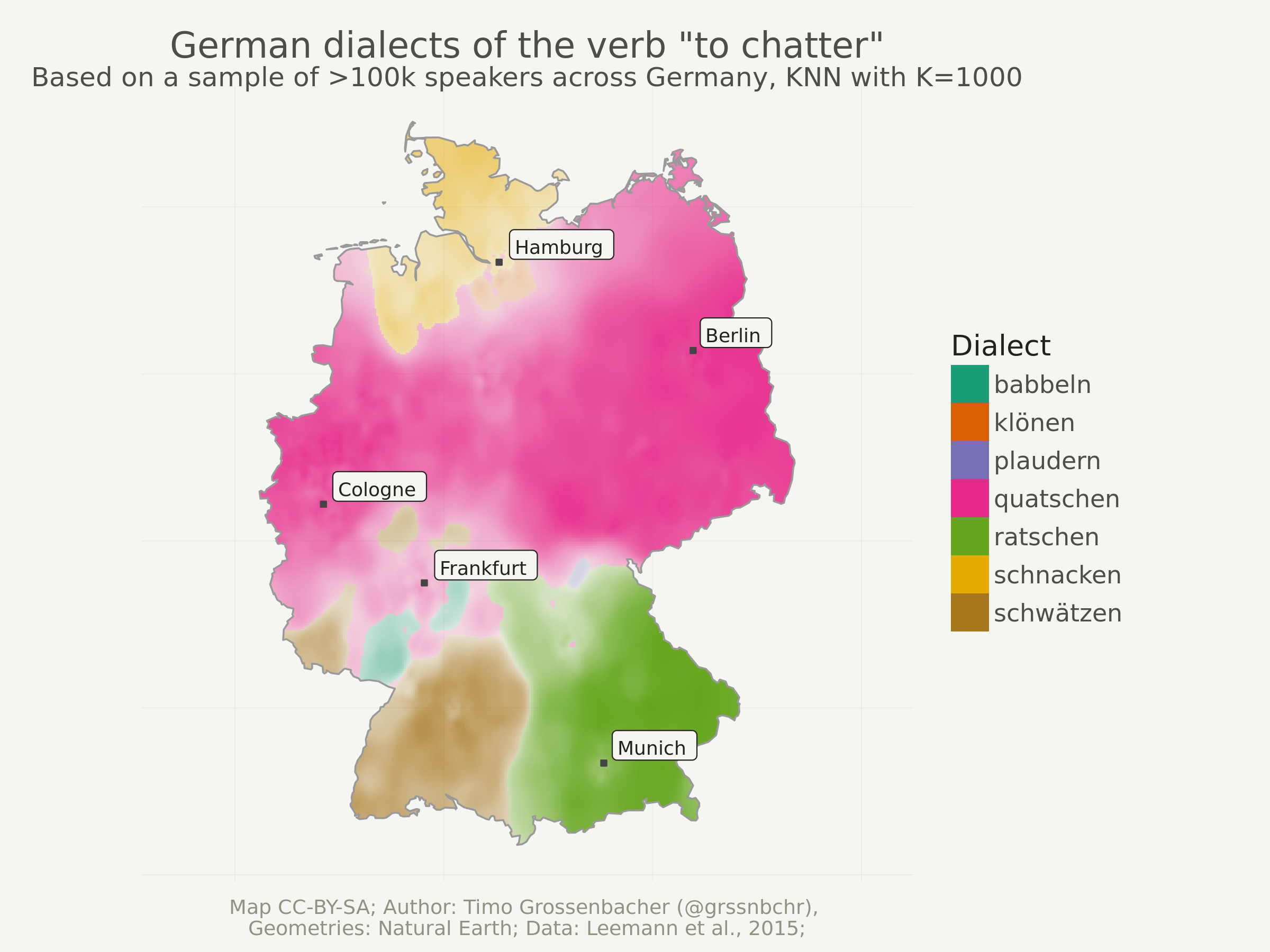
In this blog post, I want to show you how you can quite easily produce
the above categorical spatial interpolation from a set of georeferenced points as shown below – and this only using the tidyverse, sf and
the package kknn. Because the computation of such interpolated images can be rather intensive and memory-heavy, I used parallel processing with 4 CPU cores. So, ideally, you also learn something about that.

That map shows regional variations of certain dialects of a German word. I used this technique when producing around 80 maps for my book project “Grüezi, Moin, Servus!” which was published last December. The georeferenced points underlying the interpolation are actually the result of a crowdsourcing project. Each point is the location of a person who selected a certain pronunciation in an online survey. You can find more details here.
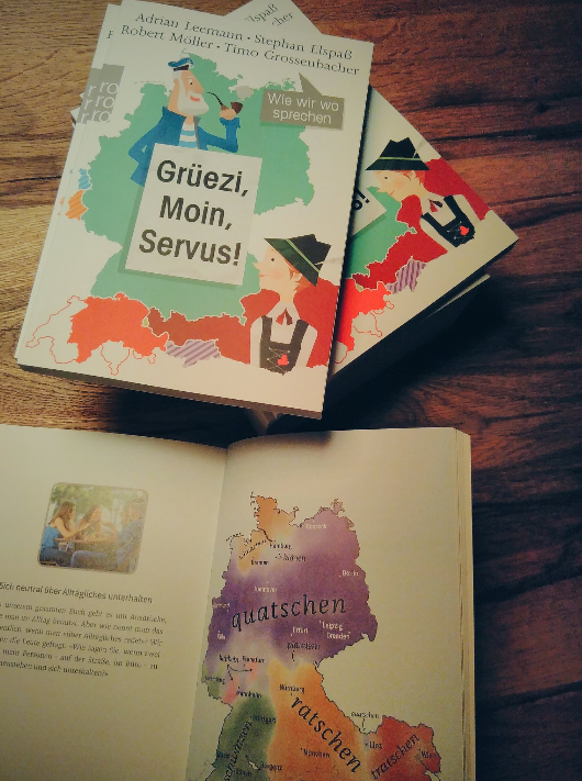
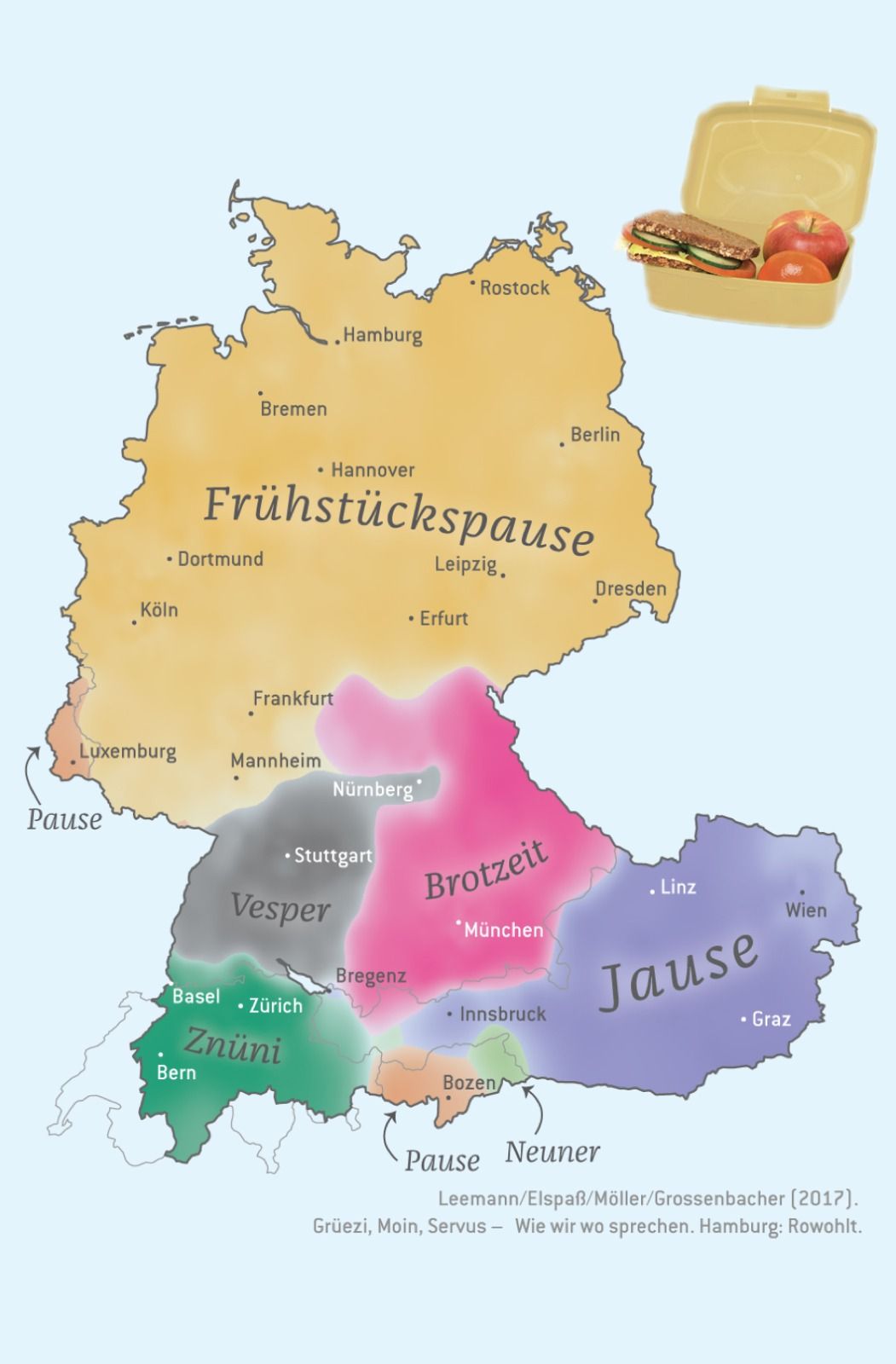
Here’s a more detailed, final map from that project, showing different
dialects of “breakfast”:
I actually tried to automate everything for that large-scale map
production, but one thing I couldn’t automate: The placement of the
(curved) labels for the dialects (I didn’t use a legend in the final
maps as you can see above). I did that in Adobe Illustrator. I can’t
imagine a way how this would automatically work for all possible edge cases (for example when the label has to be put outside of the map because the area is too small).
Outline
This tutorial is structured as follows:
- Read in the data, first the geometries (Germany political boundaries), then the point data upon which the interpolation will be based on.
- Preprocess the data (simplify geometries, convert CSV point data into an
sfobject, reproject the geodata into the ETRS CRS, clip the point data to Germany, so data outside of Germany is discarded). - Then, a regular grid without “data” is created. Each cell in this grid will later be interpolated from the point data.
- Run the spatial interpolation with the
kknnpackage. Since this is quite computationally and memory intensive, the grid is split up into 20 batches, and each batch is computed by a single CPU core in parallel. - Visualize the resulting grid with
ggplot2.
Reproducibility
As always, you can reproduce, reuse and remix everything you find here, just go to this repository and clone it. All the needed input files are in the input folder, and the main file to execute is index.Rmd. Right now, knitting it produces an index.md that I use for my blog post on timogrossenbacher.ch, but you can adapt the script to produce an HTML file, too. The PNGs produced herein are saved to wp-content/uploads/2018/03 so I can display them directly in my blog, but of course you can also adjust this.
GitHub
The code for the herein described process can also be freely downloaded from https://github.com/grssnbchr/categorical-spatial-interpolation.
License
CC-BY-SA
Preparations
Clear workspace and install necessary packages
What follows from here until the section Load Data is just my usual routine: Detach all packages, remove all variables in the global environment, etc, and then load the packages from the MRAN server (a snapshot from September 1st, 2017). With this, I ensure reproducibility and cross-device compatibility. I use my freely available template for this, with some adaptions detailed under Reproducibility.
## [1] "package package:rmarkdown detached"
Define packages
For this project, I just used the usual suspects, i.e. tidyverse
packages, the new and shiny sf for geodata processing, rnaturalearth for downloading political boundaries of Germany, foreach and doParallel for parallel processing and kknn for categorical k-nearest-neighbor interpolation. That’s it, that’s all.
# from https://mran.revolutionanalytics.com/web/packages/checkpoint/vignettes/using-checkpoint-with-knitr.html
# if you don't need a package, remove it from here (commenting is probably not sufficient)
# tidyverse: see https://blog.rstudio.org/2016/09/15/tidyverse-1-0-0/
cat("
library(tidyverse) # ggplot2, dplyr, tidyr, readr, purrr, tibble
library(magrittr) # pipes
library(forcats) # easier factor handling,
library(lintr) # code linting
library(sf) # spatial data handling
library(rnaturalearth) # country borders geometries from naturalearth.org
library(foreach) # parallel computing
library(doParallel) # parallel computing
library(kknn) # categorical knn
library(rmarkdown) # knitting",
file = "manifest.R")
Install packages
#
# if checkpoint is not yet installed, install it (for people using this
# system for the first time)
if (!require(checkpoint)) {
  if (!require(devtools)) {
    install.packages("devtools", repos = "http://cran.us.r-project.org")
    require(devtools)
  }
  devtools::install_github("RevolutionAnalytics/checkpoint",
                           ref = "v0.3.2", # could be adapted later,
                           # as of now (beginning of July 2017
                           # this is the current release on CRAN)
                           repos = "http://cran.us.r-project.org")
  require(checkpoint)
}
# nolint start
if (!dir.exists("~/.checkpoint")) {
  dir.create("~/.checkpoint")
}
# nolint end
# install packages for the specified CRAN snapshot date
checkpoint(snapshotDate = package_date,
           project = path_to_wd,
           verbose = T,
           scanForPackages = T,
           use.knitr = F,
           R.version = R_version)
rm(package_date)
Load packages
source("manifest.R")
unlink("manifest.R")
sessionInfo()
## R version 3.4.4 (2018-03-15)
## Platform: x86_64-pc-linux-gnu (64-bit)
## Running under: Ubuntu 18.04.2 LTS
##
## Matrix products: default
## BLAS: /opt/R/R-3.4.4/lib/R/lib/libRblas.so
## LAPACK: /opt/R/R-3.4.4/lib/R/lib/libRlapack.so
##
## locale:
##  [1] LC_CTYPE=en_US.UTF-8       LC_NUMERIC=C
##  [3] LC_TIME=de_CH.UTF-8        LC_COLLATE=en_US.UTF-8
##  [5] LC_MONETARY=de_CH.UTF-8    LC_MESSAGES=en_US.UTF-8
##  [7] LC_PAPER=de_CH.UTF-8       LC_NAME=C
##  [9] LC_ADDRESS=C               LC_TELEPHONE=C
## [11] LC_MEASUREMENT=de_CH.UTF-8 LC_IDENTIFICATION=C
##
## attached base packages:
## [1] parallel  stats     graphics  grDevices utils     datasets  methods
## [8] base
##
## other attached packages:
##  [1] rmarkdown_1.6       kknn_1.3.1          doParallel_1.0.10
##  [4] iterators_1.0.8     foreach_1.4.3       rnaturalearth_0.1.0
##  [7] sf_0.5-4            lintr_1.0.1         forcats_0.2.0
## [10] magrittr_1.5        dplyr_0.7.2         purrr_0.2.3
## [13] readr_1.1.1         tidyr_0.7.0         tibble_1.3.4
## [16] ggplot2_2.2.1       tidyverse_1.1.1     checkpoint_0.4.0
##
## loaded via a namespace (and not attached):
##  [1] reshape2_1.4.2   haven_1.1.0      lattice_0.20-35  colorspace_1.3-2
##  [5] htmltools_0.3.6  yaml_2.1.14      rlang_0.1.2      foreign_0.8-69
##  [9] glue_1.3.1       DBI_0.7          sp_1.2-5         modelr_0.1.1
## [13] readxl_1.0.0     bindrcpp_0.2     bindr_0.1        plyr_1.8.4
## [17] stringr_1.2.0    munsell_0.4.3    gtable_0.2.0     cellranger_1.1.0
## [21] rvest_0.3.2      codetools_0.2-15 psych_1.7.5      evaluate_0.10.1
## [25] knitr_1.17       rex_1.1.1        broom_0.4.2      Rcpp_0.12.12
## [29] udunits2_0.13    scales_0.5.0     backports_1.1.0  jsonlite_1.5
## [33] mnormt_1.5-5     hms_0.3          digest_0.6.12    stringi_1.1.5
## [37] grid_3.4.4       rprojroot_1.2    tools_3.4.4      lazyeval_0.2.0
## [41] pkgconfig_2.0.1  Matrix_1.2-12    xml2_1.1.1       lubridate_1.6.0
## [45] assertthat_0.2.0 httr_1.3.1       R6_2.2.2         igraph_1.1.2
## [49] units_0.4-6      nlme_3.1-131.1   compiler_3.4.4
Load Data
Geometries
Political boundaries of Germany can be directly downloaded from naturalearth.com with the rnaturalearth package.
Here I load the admin_1 boundaries of the whole world, from which German states (“Bundesländer” like “Berlin-Brandenburg”) are filtered.
I am going to dissolve them further below.
# admin1_10 <- ne_download(scale = 10, type = 'states', category = 'cultural')
# save(admin1_10, file = "input/admin1_10.RData")
# I stored this into the admin1_10 .RData variable to save time.
load("input/admin1_10.RData")
# convert to sf
admin1_10 %<>%
  st_as_sf()
# extract German states
states_germany <- admin1_10 %>%
  filter(iso_a2 == "DE")
# clean up
rm(admin1_10)
Point Data
The point data is loaded from a CSV file (phrase_7.csv) which I prepared beforehand. It contains a random 150k sample of the whole data set, which in turn encompassed around 700k points from the German speaking region of Europe (Germany, Austria, Switzerland, etc.).
# load lookup table with integer <> pronunciation mapping
lookup_table <- read_csv("input/pronunciations.csv",
                         col_names = c("pronunciation",
                                       "phrase",
                                       "verbatim",
                                       "nil")) %>%
  filter(phrase == 7) # only the phrase we need
## Parsed with column specification:
## cols(
##   pronunciation = col_integer(),
##   phrase = col_integer(),
##   verbatim = col_character(),
##   nil = col_integer()
## )
# load actual answer data
point_data <- read_csv("input/phrase_7.csv")
## Parsed with column specification:
## cols(
##   phrase_id = col_integer(),
##   pronunciation_id = col_integer(),
##   lat = col_double(),
##   lng = col_double()
## )
# convert pronunciation into a factor
point_data %<>%
  left_join(lookup_table, by = c("pronunciation_id" = "pronunciation")) %>%
  select(-phrase_id, -pronunciation_id, -phrase, -nil) %>%
  rename(pronunciation_id = verbatim) %>%
  mutate(pronunciation_id = as.factor(pronunciation_id))

# look at the data
point_data %>% head()
## # A tibble: 6 x 3
##        lat       lng pronunciation_id
##      <dbl>     <dbl>           <fctr>
## 1 50.81461  6.242981        quatschen
## 2 50.62507  7.119141        quatschen
## 3 50.12058  8.789062          babbeln
## 4 51.19312 14.677734        quatschen
## 5 48.87917  9.338379        tratschen
## 6 51.04139 14.523926        quatschen
Cities
I also labelled some big German cities in the map to provide some orientation. These are available from simplemaps.com (there are certainly other data sets, this is just what a quick DuckDuckGo search revealed…).
# load cities from Simple Maps
# https://simplemaps.com/data/world-cities
cities <- read_csv("input/simplemaps-worldcities-basic.csv") %>%
  # preprocess
  mutate(city = as.character(city),
             lat = as.numeric(as.character(lat)),
             lng = as.numeric(as.character(lng))) %>%
  filter(country == "Germany") %>%
  filter(city %in% c("Munich", "Berlin", "Hamburg", "Cologne", "Frankfurt"))
## Parsed with column specification:
## cols(
##   city = col_character(),
##   city_ascii = col_character(),
##   lat = col_double(),
##   lng = col_double(),
##   pop = col_double(),
##   country = col_character(),
##   iso2 = col_character(),
##   iso3 = col_character(),
##   province = col_character()
## )
Preprocess Data
Simplify Geometries and Extract Germany
First of all, I dissolve all German states into the country boundaries. This can be elegantly achieved using dplyr syntax, namely group_by and summarize without arguments.
I also don’t need highly granular geometries because the map is going to be plotted rather small-scale. So I use sf’s st_simplify to apply a simplification algorithm.
# st_dissolve according to
# https://github.com/r-spatial/sf/issues/290#issuecomment-291785445
germany <- states_germany %>%
  group_by(iso_a2) %>%
  summarize()
# simplify
germany %<>%
  st_simplify(preserveTopology = T, dTolerance = 0.01)
## Warning in st_simplify.sfc(st_geometry(x), preserveTopology, dTolerance):
## st_simplify does not correctly simplify longitude/latitude data, dTolerance
## needs to be in decimal degrees
# clean
rm(states_germany)
Convert Point Data into Geodata
The point data is still a regular data frame with only implicit geometries. I convert them to a sf object here, specifying the WGS84 coordinate system.
point_data %<>%
  st_as_sf(coords = c("lng", "lat"),
           crs = "+proj=longlat +ellps=WGS84")
Convert Cities into Geodata
Same for the cities.
cities %<>%
  st_as_sf(coords = c("lng", "lat"),
           crs = "+proj=longlat +ellps=WGS84")
Reproject Geodata
The three geodata sets germany, point_data and cities are nowreprojected to the ETRS coordinate system, which is more suited for Central Europe.
# CRS: ETRS
etrs <- "+proj=utm +zone=32 +ellps=GRS80 +units=m +no_defs"
germany %<>%
  st_transform(etrs)
point_data %<>%
  st_transform(etrs)
cities %<>%
  st_transform(etrs)
Clip Point Data to Buffered Germany
Since the 150k point sample still covers the whole German-speaking region, including countries like Switzerland, and I only want to have points for Germany, I clip them using old-school subsetting.
Before that though, I have to draw a 10km buffer around Germany, because I want to include also some points outside of Germany. If I didn’t do that, the interpolation close to the German border would look weird.
germany_buffered <- germany %>%
  st_buffer(dist = 10000) # in meters, 10km buffer
point_data <- point_data[germany_buffered, ]
Make Regular Grid
Now it starts to get interesting. The goal of this whole exercise is interpolating a discrete geometric point data set to a continuous surface, represented by a regular grid (a “raster” in geoscience terms).
For that, I create a regular grid with st_make_grid from the sf package. This function takes an sf object like germany_buffered and creates a grid with a certain cellsize (in meters) over the extent of that sf object. You also need to tell it the number of cells in each dimension (n).
I know how many pixels (= grid cells) in the x-dimension there should be: 300. A higher number results in an almost quadratically increasing computing time. A lower number takes faster to compute, but yields a less continuous, more pixelated surface. Try out different values here and look at the end result if you don’t know what I mean :-)
From that number, the height of the grid in pixels is computed (because that depends on the aspect ratio of Germany).
# specify grid width in pixels
width_in_pixels <- 300
# dx is the width of a grid cell in meters
dx <- ceiling( (st_bbox(germany_buffered)["xmax"] -
                 st_bbox(germany_buffered)["xmin"]) / width_in_pixels)
# dy is the height of a grid cell in meters
# because we use quadratic grid cells, dx == dy
dy <- dx
# calculate the height in pixels of the resulting grid
height_in_pixels <- floor( (st_bbox(germany_buffered)["ymax"] -
                             st_bbox(germany_buffered)["ymin"]) / dy)

grid <- st_make_grid(germany_buffered,
                     cellsize = dx,
                     n = c(width_in_pixels, height_in_pixels),
                     what = "centers"
                     )

rm(dx, dy, height_in_pixels, germany_buffered)

plot(grid)

Well, that grid doesn’t look too spectacular. If you zoomed in though, you would see the single grid cells, or rather: points. Why that? I didn’t actually create a “raster” as one would do with the raster package. sf returns an sfc object with center points of the grid cells. A “traditional” raster is not needed because ggplot2::geom_raster just needs a data frame with grid cell positions and draws a continuous surface from it, not a collection of discrete points like geom_point. But more about that later.
Prepare Training Set
The “training set” is basically the point data set with the single dialects. This stems from statistical learning terminology, as I actually use a method from that area, the so-called k-nearest-neighbor interpolation (which can also be used for predictive analytics, for example).
First, I convert the geometric point data set back to a regular data frame, where lon and lat are nothing more than numeric values without any geographical meaning.
I also use some dplyr magic to only retain the 8 most prominent dialects in the 150k point data set. Why? Because plotting more than 8 different colors in the final map is a pain for the eyes – the different areas couldn’t be distinguished anymore. But bear in mind: The more we summarize the data set, the more local specialities we lose (endemic dialects that only appear in one city, for instance).
dialects_train <- data.frame(dialect = point_data$pronunciation_id,
                             lon = st_coordinates(point_data)[, 1],
                             lat = st_coordinates(point_data)[, 2])
# only keep 8 most prominent dialects
dialects_train %<>%
  group_by(dialect) %>%
  nest() %>%
  mutate(num = map_int(data, nrow)) %>%
  arrange(desc(num)) %>%
  slice(1:8) %>%
  unnest() %>%
  select(-num)

# clean up
rm(point_data)
Run KNN on Training Set
Now the magic happens. I use the kknn function from the same-named package to interpolate from the training set (point data, dialects_train) to the test data set (continuous, regular grid, dialects_result). The latter is derived from the coordinates of the just created regular grid. The function kknn takes these two data frames and a formula dialect . ~ which tells it to interpolate the dialect factor variable according to all other variables, which are nothing more than lng and lat. The cool thing is that these don’t have to be geographical at all – but of course, this technique is often used for geographical interpolations. The kknn function takes k as the last parameter: it specifies from how many neighboring points (from the point data set) a grid cell will be interpolated.
I use k = 1000 below, and also tried out other values (there’s another example with k = 2000 at the end of this post). The bigger this value, the “smoother” the resulting surface will be, the more local details vanish. It’s hard to say which of these details are just noise or actual local language varieties. One could certainly account for this by doing something like cross-fold-validation, but since I first and foremost wanted to produce very coarse maps for a popular culture book, I kind of neglected this part. Furthermore, my co-authors, who are all linguists, doublechecked each map for its linguistic plausibility.
What’s special about kknn is that it can interpolate categorical variables like the factor at hand here. Usually with spatial interpolation, KNN is used to interpolate continuous variables like temperatures from point measurements.
When working on this project I struggled a lot with engineering problems, because computing only a 300 x 500 or so grid would take so much memory, my computer would freeze all the time. I then bought 8 GB of additional RAM just to discover that I now can interpolate 300 x 500, but nothing more. Eventually I desperately posted a question to the creator of the kknn package who quickly replied – thanks again @KlausVigo. His answer opened my eyes. I could split up the result grid and compute each tile separately! This solves the memory problems because the tiles are small enough to easily fit into memory, and also speeds up the computation by a factor of maybe 2 or 3 when computing on 4 cores.
This works by specifying a function computeGrid which is executed in parallel with the foreach and doParallel pattern. That function takes a specific section of the grid object – specified with regular subsetting, e.g. grid[1:3000]. In other words: The grid tiles / batches don’t even need to be rectangular, which I only started to realize when I wrote this blog post (before that I used the package SpaDES::splitRaster to split up a traditional raster-grid into regular tiles, but for this blog post I wanted to keep the dependencies on a minimum).
On a 4-CPU-core-laptop like mine, the following takes about 5 minutes. Calculating ~80 maps with a grid width of 1000 (instead of 300), which I had to do for my book, took quite some time, as you can imagine. I actually experimented with “outsourcing” this calcualation to a remote cluster (for instance provided by Microsoft Azure), but then that was quite costly and I decided that for my one-time-use, it would be easier to compute it locally.
After dialects_result is computed for each grid section, it contains the probability for each dialect at each grid cell. So within computeGrid, I also use the apply function to only retain the most probable dialect at each cell (and its probability, which sometimes can be less than .5), because I want to show a map of all the 8 most prominent dialects in Germany, not a single probability map for each dialect (this would of course also be possible with this method).
At the very end of this complicated code chunk, dialects_result is converted back to a sf object, so it can be clipped to Germany, again using regular subsetting (remember the grid would be rectangular, but I only want to retain the interpolated surface of Germany).
# config
k <- 1000 # "k" for k-nearest-neighbour-interpolation

# specify function which is executed for each tile of the grid
computeGrid <- function(grid, dialects_train, knn) {
  # create empty result data frame
  dialects_result <- data.frame(dialect = as.factor(NA),
                                lon = st_coordinates(grid)[, 1],
                                lat = st_coordinates(grid)[, 2])
  # run KKNN
  dialects_kknn <- kknn::kknn(dialect ~ .,
                        train = dialects_train,
                        test = dialects_result,
                        kernel = "gaussian",
                        k = knn)
  # bring back to result data frame
  # only retain the probability of the dominant dialect at that grid cell
  dialects_result %<>%
    # extract the interpolated dialect at each grid cell with the
    # kknn::fitted function
    mutate(dialect = fitted(dialects_kknn),
           # only retain the probability of the interpolated dialect,
           # discard the other 7
           prob = apply(dialects_kknn$prob,
                                1,
                                function(x) max(x)))
  return(dialects_result)
}

# specify the number of cores below (adapt if you have fewer cores or
# want to reserve some computation power to other stuff)
registerDoParallel(cores = 8)

# specify number of batches and resulting size of each batch (in grid cells)
no_batches <- 60 # increase this number if you run into memory problems
batch_size <- ceiling(length(grid) / no_batches)

# PARALLEL COMPUTATION
start.time <- Sys.time()
dialects_result <- foreach(
  batch_no = 1:no_batches,
  # after each grid section is computed, rbind the resulting df into
  # one big dialects_result df
  .combine = rbind,
  # the order of grid computation doesn't matter: this speeds it up even more
  .inorder = FALSE) %dopar% {
    # compute indices for each grid section, depending on batch_size and current
    # batch
    start_idx <- (batch_no - 1) * batch_size + 1
    end_idx <- batch_no * batch_size
    # specify which section of the grid to interpolate, using regular
    # subsetting
    grid_batch <- grid[start_idx:ifelse(end_idx > length(grid),
                                        length(grid),
                                        end_idx)]
    # apply the actual computation to each grid section
    df <- computeGrid(grid_batch, dialects_train, k)
}
end.time <- Sys.time()
time.taken <- end.time - start.time
time.taken
## Time difference of 1.708192 mins
# convert resulting df back to sf object, but do not remove raw geometry cols
dialects_raster <- st_as_sf(dialects_result,
                            coords = c("lon", "lat"),
                            crs = etrs,
                            remove = F)
# clip raster to Germany again
dialects_raster <- dialects_raster[germany, ]
rm(dialects_result, k)
Visualize
Now I can finally visualize all that beautifully processed data!
Define a map theme
I first define a theme for the map, e.g. I remove all axes, add a subtle grid etc. I mostly took this from a previous blog post of mine.
theme_map <- function(...) {
  theme_minimal() +
  theme(
    text = element_text(family = "Ubuntu Regular", color = "#22211d"),
    # remove all axes
    axis.line = element_blank(),
    axis.text.x = element_blank(),
    axis.text.y = element_blank(),
    axis.ticks = element_blank(),
    axis.title.x = element_blank(),
    axis.title.y = element_blank(),
    # add a subtle grid
    panel.grid.major = element_line(color = "#ebebe5", size = 0.2),
    panel.grid.minor = element_blank(),
    plot.background = element_rect(fill = "#f5f5f2", color = NA),
    plot.margin = unit(c(.5, .5, .2, .5), "cm"),
    panel.border = element_blank(),
    panel.background = element_rect(fill = "#f5f5f2", color = NA),
    panel.spacing = unit(c(-.1, 0.2, .2, 0.2), "cm"),
    legend.background = element_rect(fill = "#f5f5f2", color = NA),
    legend.title = element_text(size = 13),
    legend.text = element_text(size = 11, hjust = 0, color = "#4e4d47"),
    plot.title = element_text(size = 16, hjust = 0.5, color = "#4e4d47"),
    plot.subtitle = element_text(size = 12, hjust = 0.5, color = "#4e4d47",
                                 margin = margin(b = -0.1,
                                                 t = -0.1,
                                                 l = 2,
                                                 unit = "cm"),
                                 debug = F),
    plot.caption = element_text(size = 9,
                                hjust = .5,
                                margin = margin(t = 0.2,
                                                b = 0,
                                                unit = "cm"),
                                color = "#939184"),
    ...
  )
}
Preparations
Because the current CRAN version of ggplot2 can still not work directly with sf objects (no judgement here, but I’m looking forward to when that will possible), I first have to convert the boundaries of Germany and the cities back to ordinary data frames. For Germany, this involves ggplot2’s fortify function, which turns a polygon geometry into a “flat” data frame.
# Germany needs to be fortified in order to be plotted (for that there
# will be geom_sf in future versions of ggplot). before that, it needs to be
# converted to the legacy Spatial* format
germany_outline <-
  as_Spatial(germany$geometry) %>%
  fortify()

# the same with the cities dataset
cities_df <-
  cities %>% select(city) %>%
  st_set_geometry(NULL)
# okay, this is a bit hacky. is there a better way to convert an sfc of type POINT
# back into an ordinary data frame?
cities_df$lng <- st_coordinates(cities)[, 1]
cities_df$lat <- st_coordinates(cities)[, 2]
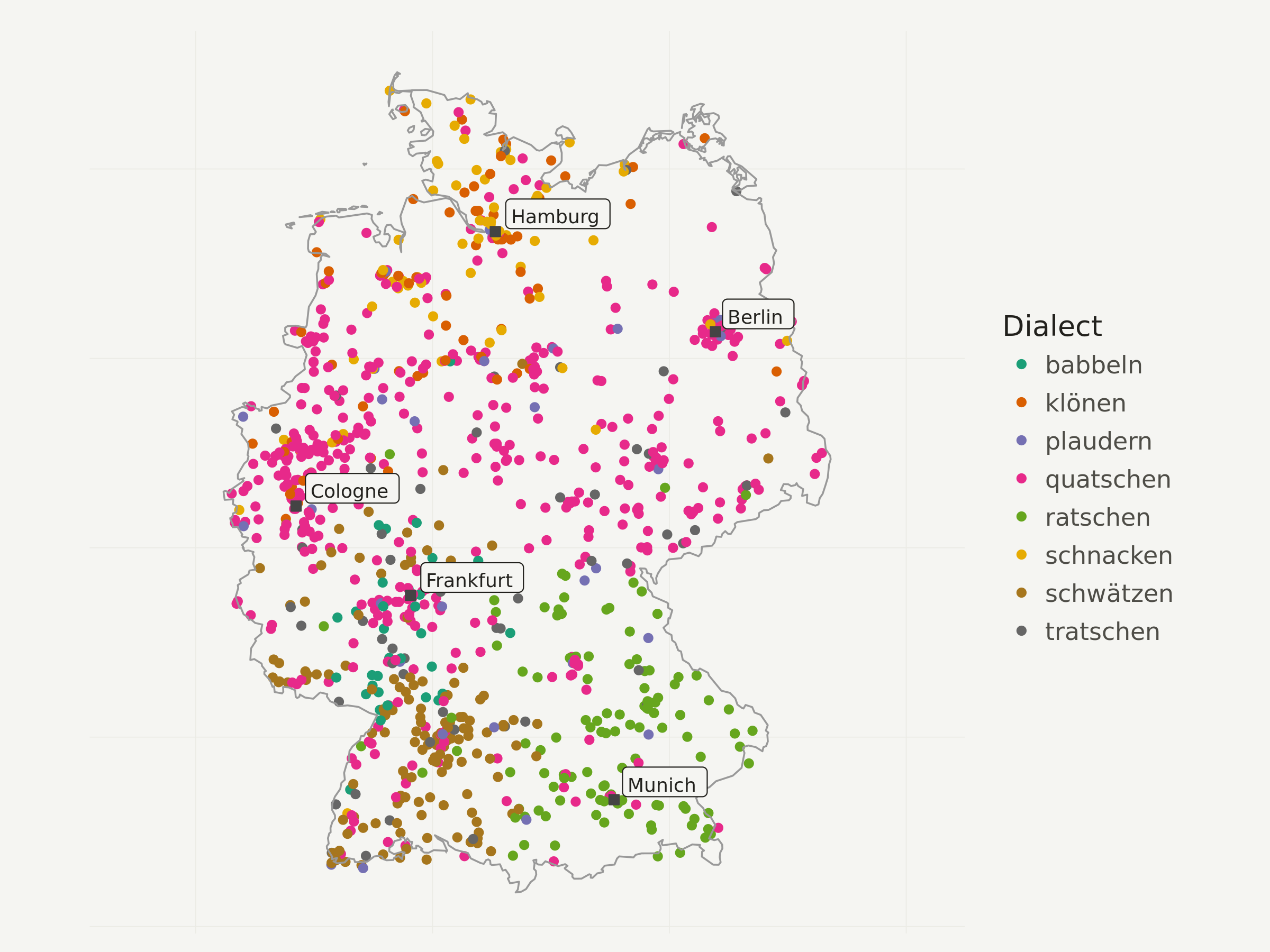
First I only visualize a N=1000 sample of all the points, so you get an idea whether the interpolation makes sense at all.
I decided to use a colorbrewer categorical color scale here, but of course one could also use the default ggplot2 scale.
# take point sample
dialects_sample <- dialects_train %>% sample_n(1000)
ggplot(data = dialects_sample) +
  geom_point(aes(x = lon, y = lat, color = dialect), alpha = 1) +
  # add Germany outline
  geom_path(data = germany_outline, aes(x = long, y = lat, group = group),
                     colour = "gray60", size = .4) +
  # add city labels
  geom_point(data = cities_df, aes(x = lng, y = lat),
             color = "#444444",
             fill = "#444444",
             shape = 22,
             size = 2) +
  geom_label(data = cities_df, aes(x = lng, y = lat, label = city),
             hjust = -.1,
             vjust = -.1,
             family = "Ubuntu Regular",
             color = "#22211d",
             fill = "#f5f5f2",
             size = 3) +
  # add color brewer palette and legend title
  scale_color_brewer(palette = "Dark2",
                    name = "Dialect"
                    ) +
  # apply map theme
  theme_map() +
  # enlarge canvas
  coord_equal(xlim = c(180000, 1020000))
Now comes the fun part. Visualizing the interpolated grid is very simple with geom_raster. Even though dialects_raster is still an sf object, geom_raster only works with the attached data frame (= no need to transform it like cities). That’s why I didn’t remove the raw geometry columns before.
geom_raster uses the fill aesthetic for the dominant dialect at the current raster cell and alpha for its probability (= dominance). This means: the more transparent an area, the less dominant is the most dominant dialect in this region.
ggplot(data = dialects_raster) +
  # add raster geom for the knn result
  geom_raster(aes(x = lon, y = lat, fill = dialect, alpha = prob)) +
  # add Germany outline
  geom_path(data = germany_outline, aes(x = long, y = lat, group = group),
                     colour = "gray60", size = .4) +
  # add city labels
  geom_point(data = cities_df, aes(x = lng, y = lat),
             color = "#444444",
             fill = "#444444",
             shape = 22,
             size = 1) +
  geom_label(data = cities_df, aes(x = lng, y = lat, label = city),
             hjust = -.1,
             vjust = -.1,
             family = "Ubuntu Regular",
             color = "#22211d",
             fill = "#f5f5f2",
             size = 3) +
  # remove propability legend
  scale_alpha_continuous(guide = F) +
  # add color brewer palette and legend titlw
  scale_fill_brewer(palette = "Dark2",
                    name = "Dialect"
                    ) +
  # apply map theme
  theme_map() +
  # enlarge canvas
  coord_equal(xlim = c(180000, 1020000)) +
  labs(title = "German dialects of the verb \"to chatter\"",
       subtitle = "Based on a sample of >100k speakers across Germany, KNN with K=1000",
       caption = "Map CC-BY-SA; Author: Timo Grossenbacher (@grssnbchr), \nGeometries: Natural Earth; Data: Leemann et al., 2015;")

One last thing: You might have noticed that only 7 different dialects remain. Depending on the number of K, some dialects can be “overruled” by others. So if I’d set K to a very high number like 20’000, probably only the globally most dominant dialect “quatschen” would remain.
Another try with higher “K”
Just to show you the effects of a higher K, here’s the same thing as above but with k = 2000. This should take approximately twice as long as the computation with k = 1000, because computation time is a linear function of the number of neighbors that need to be taken into account for each grid cell. In other words: increasing k is a rather cheap operation in comparison to increasing the grid resolution.
Notice how smaller regions disappear and how the boundaries between dialect regions are smoother.
k <- 2000 # "k" for k-nearest-neighbour-interpolation

# PARALLEL COMPUTATION
start.time <- Sys.time()
dialects_result <- foreach(
  batch_no = 1:no_batches,
  .combine = rbind,
  .inorder = FALSE) %dopar% {
    start_idx <- (batch_no - 1) * batch_size + 1
    end_idx <- batch_no * batch_size
    grid_batch <- grid[start_idx:ifelse(end_idx > length(grid),
                                        length(grid),
                                        end_idx)]
    df <- computeGrid(grid_batch, dialects_train, k)
}
end.time <- Sys.time()
time.taken <- end.time - start.time
time.taken
## Time difference of 4.347019 mins
# convert resulting df back to sf object, but do not remove raw geometry cols
dialects_raster <- st_as_sf(dialects_result,
                            coords = c("lon", "lat"),
                            crs = etrs,
                            remove = F)
# clip raster to Germany again
dialects_raster <- dialects_raster[germany, ]
rm(dialects_result, grid, k)

ggplot(data = dialects_raster) +
  # add raster geom for the knn result
  geom_raster(aes(x = lon, y = lat, fill = dialect, alpha = prob)) +
  # add Germany outline
  geom_path(data = germany_outline, aes(x = long, y = lat, group = group),
                     colour = "gray60", size = .4) +
  # add city labels
  geom_point(data = cities_df, aes(x = lng, y = lat),
             color = "#444444",
             fill = "#444444",
             shape = 22,
             size = 1) +
  geom_label(data = cities_df, aes(x = lng, y = lat, label = city),
             hjust = -.1,
             vjust = -.1,
             family = "Ubuntu Regular",
             color = "#22211d",
             fill = "#f5f5f2",
             size = 3) +
  # remove propability legend
  scale_alpha_continuous(guide = F) +
  # add color brewer palette and legend titlw
  scale_fill_brewer(palette = "Dark2",
                    name = "Dialect"
                    ) +
  # apply map theme
  theme_map() +
  # enlarge canvas
  coord_equal(xlim = c(180000, 1020000)) +
  labs(title = "German dialects of the verb \"to chatter\"",
       subtitle = "Based on a sample of >100k speakers across Germany, KNN with K=2000",
       caption = "Map CC-BY-SA; Author: Timo Grossenbacher (@grssnbchr), \nGeometries: Natural Earth; Data: Leemann et al., 2015;")

That’s it. If you have questions, write a comment or an email, and as always, follow me on Twitter if you still don’t.