Bivariate maps with ggplot2 and sf
This post guides you through creating a beautiful, bivariate thematic map using solely two R packages, ggplot2 and sf.

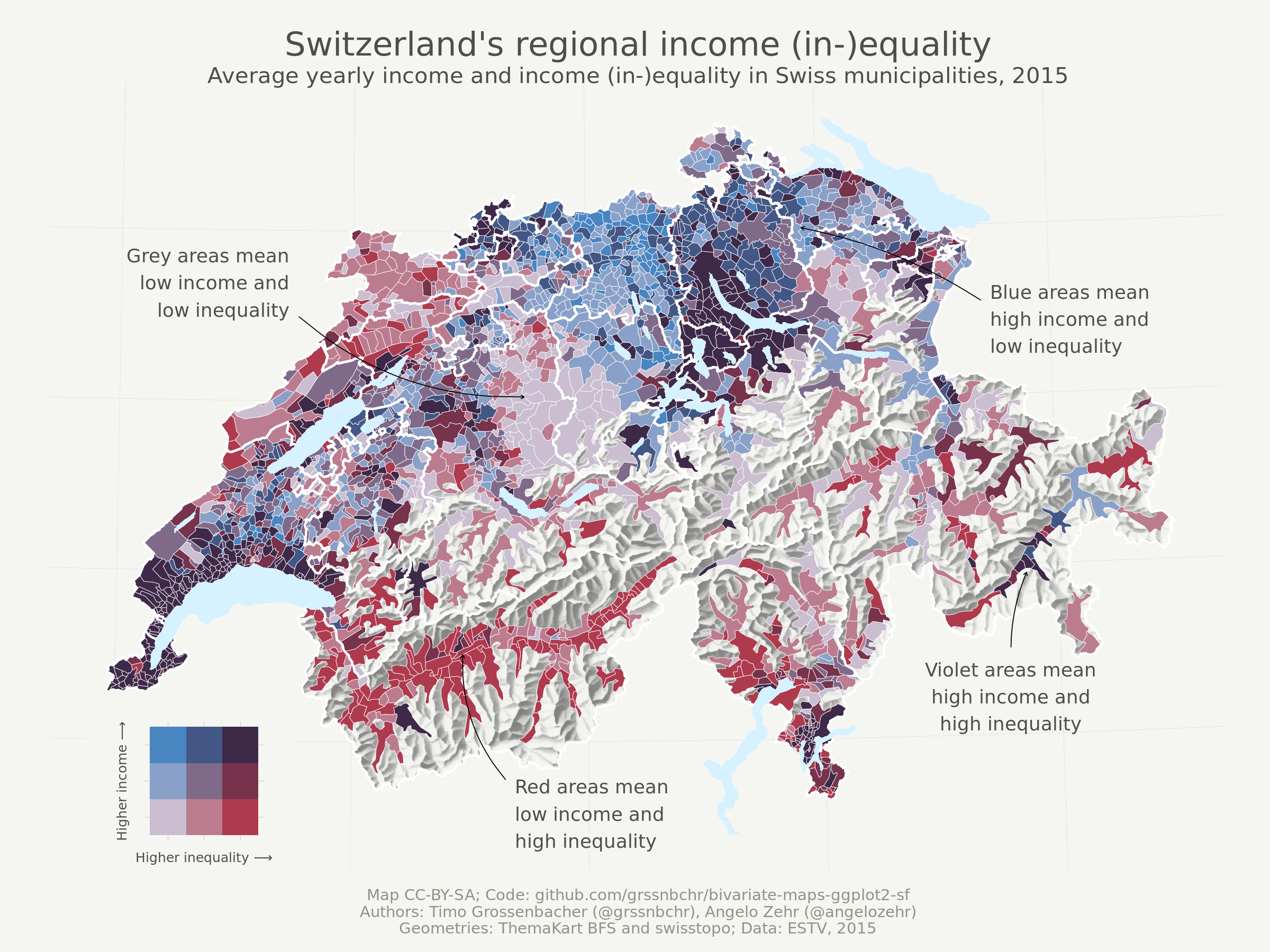
The above map shows income (in-)equality in Switzerland on the municipality level by visualizing two variables at the same time: the Gini coefficient and average income (in Swiss Francs). It uses a so-called bivariate color scale, blending two different color scales into one. Lastly, it uses the beautiful relief depicting the mountainous Swiss landscape. Here we’re going to show you how to produce such a map exclusively with R.
For this blog post, I worked together with my colleague Angelo Zehr who recently published a nice bivariate thematic map comparing income (in-)equality and average income in Switzerland.
What is different from said post?
- With the
sfpackacke and its integration intoggplot2through thegeom_sf()function, it is nowadays even easier to quickly create thematic maps. - This post does not only show how to produce a simple univariate choropleth (another word for a thematic map where the (fill) color is used as the main visual variable) but also how to combine two variables into a bivariate color scale.
- It introduces a suitable legend for bivariate color scales using
geom_tile(). - It shows how to add annotations that explain spatial patterns.
Outline
This tutorial is structured as follows:
- Read in the thematic data and geodata and join them.
- Define a general map theme.
- Create a univariate thematic map showing the average income. This largely draws from a previous post (no longer available) and involves techniques for custom color classes and advanced aesthetics. People who merely want an update regarding
sfand how it interacts withggplot2can just read this section. - Create a bivariate thematic map showing average income and income (in-)equality at the same time. In this process, a custom legend is created and added to the plot, and annotations explaining different spatial patterns are added as well.
- Oh, and lakes and cantonal borders (cantons = Swiss provinces) are now added as well.
Let’s go!
Reproducibility
As always, you can reproduce, reuse and remix everything you find here, just go to this repository and clone it. All the needed input files are in the input folder, and the main file to execute is index.Rmd. Right now, knitting it produces an index.md that I use for my blog post on timogrossenbacher.ch, but you can adapt the script to produce an HTML file, too. The PNGs produced herein are saved to wp-content/uploads/2019/04 so I can display them directly in my blog, but of course you can also adjust this.
GitHub
The code for the herein described process can also be freely downloaded from https://github.com/grssnbchr/bivariate-maps-ggplot2-sf.
License
CC-BY-SA
Version information
This report was generated on 2019-11-23 13:01:05. R version: 3.5.3 on x86_64-pc-linux-gnu. For this report, CRAN packages as of 2019-03-01 were used.
Preparations
Clear workspace and install necessary packages
What follows from here until the section Data Sources is just the usual routine: Detach all packages, remove all variables in the global environment, etc, and then load the packages from the MRAN server (a snapshot from March 1st, 2019). With this, we ensure reproducibility and cross-device compatibility. We use Timo’s freely available template for this, with some adaptions detailed under Reproducibility.
Define packages
For this project, we use the usual suspects, i.e. tidyverse packages including ggplot2 for plotting, sf for geodata processing and raster for working with (spatial) raster data, i.e. the relief. Also, the viridis package imports the beautiful Viridis color scale we use for the univariate map. Lastly, cowplot is used to combine the bivariate map and its custom legend.
# from https://mran.revolutionanalytics.com/web/packages/checkpoint/vignettes/using-checkpoint-with-knitr.html
# if you don't need a package, remove it from here (commenting is probably not sufficient)
cat("
library(rstudioapi)
library(tidyverse) # ggplot2, dplyr, tidyr, readr, purrr, tibble
library(magrittr) # pipes
library(lintr) # code linting
library(sf) # spatial data handling
library(raster) # raster handling (needed for relief)
library(viridis) # viridis color scale
library(cowplot) # stack ggplots
library(rmarkdown)",
file = "manifest.R")
Install packages
If you’re interested in what the following does, we recommend going through the explanations for rddj-template.
# if checkpoint is not yet installed, install it (for people using this
# system for the first time)
if (!require(checkpoint)) {
  if (!require(devtools)) {
    install.packages("devtools", repos = "http://cran.us.r-project.org")
    require(devtools)
  }
  devtools::install_github("RevolutionAnalytics/checkpoint",
                           ref = "v0.3.2", # could be adapted later,
                           # as of now (beginning of July 2017
                           # this is the current release on CRAN)
                           repos = "http://cran.us.r-project.org")
  require(checkpoint)
}
# nolint start
if (!dir.exists("~/.checkpoint")) {
  dir.create("~/.checkpoint")
}
# nolint end
# install packages for the specified CRAN snapshot date
checkpoint(snapshotDate = package_date,
           project = path_to_wd,
           verbose = T,
           scanForPackages = T,
           use.knitr = F,
           R.version = R_version)
rm(package_date)
Load packages
Here the packages are actually loaded. From the sessionInfo() output you can see the exact version numbers of packages used herein.
source("manifest.R")
unlink("manifest.R")
sessionInfo()
## R version 3.5.3 (2019-03-11)
## Platform: x86_64-pc-linux-gnu (64-bit)
## Running under: Ubuntu 18.04.3 LTS
##
## Matrix products: default
## BLAS: /opt/R/R-3.5.3/lib/R/lib/libRblas.so
## LAPACK: /opt/R/R-3.5.3/lib/R/lib/libRlapack.so
##
## locale:
##  [1] LC_CTYPE=en_US.UTF-8       LC_NUMERIC=C
##  [3] LC_TIME=de_CH.UTF-8        LC_COLLATE=en_US.UTF-8
##  [5] LC_MONETARY=de_CH.UTF-8    LC_MESSAGES=en_US.UTF-8
##  [7] LC_PAPER=de_CH.UTF-8       LC_NAME=C
##  [9] LC_ADDRESS=C               LC_TELEPHONE=C
## [11] LC_MEASUREMENT=de_CH.UTF-8 LC_IDENTIFICATION=C
##
## attached base packages:
## [1] stats     graphics  grDevices utils     datasets  methods   base
##
## other attached packages:
##  [1] rmarkdown_1.11    cowplot_0.9.4     viridis_0.5.1
##  [4] viridisLite_0.3.0 raster_2.8-19     sp_1.3-1
##  [7] sf_0.7-3          lintr_1.0.3       magrittr_1.5
## [10] forcats_0.4.0     stringr_1.4.0     dplyr_0.8.0.1
## [13] purrr_0.3.0       readr_1.3.1       tidyr_0.8.2
## [16] tibble_2.0.1      ggplot2_3.1.0     tidyverse_1.2.1
## [19] checkpoint_0.4.0  rstudioapi_0.9.0  knitr_1.21
##
## loaded via a namespace (and not attached):
##  [1] tidyselect_0.2.5 xfun_0.5         haven_2.1.0      lattice_0.20-38
##  [5] colorspace_1.4-0 generics_0.0.2   htmltools_0.3.6  yaml_2.2.0
##  [9] rlang_0.3.1      e1071_1.7-0.1    pillar_1.3.1     glue_1.3.0
## [13] withr_2.1.2      DBI_1.0.0        modelr_0.1.4     readxl_1.3.0
## [17] plyr_1.8.4       munsell_0.5.0    gtable_0.2.0     cellranger_1.1.0
## [21] rvest_0.3.2      codetools_0.2-16 evaluate_0.13    rex_1.1.2
## [25] class_7.3-15     broom_0.5.1      Rcpp_1.0.0       scales_1.0.0
## [29] backports_1.1.3  classInt_0.3-1   jsonlite_1.6     gridExtra_2.3
## [33] hms_0.4.2        digest_0.6.18    stringi_1.3.1    grid_3.5.3
## [37] cli_1.0.1        tools_3.5.3      lazyeval_0.2.1   crayon_1.3.4
## [41] pkgconfig_2.0.2  xml2_1.2.0       lubridate_1.7.4  assertthat_0.2.0
## [45] httr_1.4.0       R6_2.4.0         units_0.6-2      nlme_3.1-137
## [49] compiler_3.5.3
Data Sources
Thematic Data
Here the thematic data to be visualized is loaded. It is contained in a CSV consisting of columns:
municipality(municipality name, not used),bfs_id(ID to match with geodata),mean(average income in the municipality)gini(the Gini index for income (in-)equality)
The data provider in this case is the Swiss Federal Tax Administration (FTA), where the original data (as an Excel) can be downloaded from here. The columns used were mean_reinka and gini_reinka for mean and gini (in the “Gemeinden - Communes” tab), respectively. See the first tabs in the Excel for a short explanation. Find additional explanations on the FTA website (German), especially in this PDF.
We used the year 2015 as it is the youngest in the available time series.
data <- read_csv("input/data.csv")
Geodata
Various geodata from the Swiss Federal Statistical Office (FSO) and the Swiss Federal Office of Topography (swisstopo) depicting Swiss borders as of 2015 are used herein.
input/gde-1-1-15.*: These geometries do not show the political borders of Swiss municipalities, but the so-called “productive” area, i.e., larger lakes and other “unproductive” areas such as mountains are excluded. This has two advantages: 1) The relatively sparsely populated but very large municipalities in the Alps don’t have too much visual weight and 2) it allows us to use the beautiful raster relief of the Alps as a background. These data are now freely available from the FSO. Click on “Download map (ZIP)”, the polygon files are in/PRO/01_INST/Vegetationsfläche_vf/K4_polgYYYYMMDD_vf; different timestamps are available, the 2015 data used here stem from another data set.input/g2*: National (s) as well as cantonal borders (k) and lakes (l). Available here.- (Hillshaded) relief: This is a freely available GeoTIFF from swisstopo. For the sake of simplicity, it was converted to the “ESRI ASCII” format using
gdal_translate -of AAIGrid 02-relief-georef.tif 02-relief-ascii.ascon the CLI. Therastercan read that format natively, without the need of explicitly installing thergdalpackage – which is not the case for GeoTIFF files.
# read cantonal borders
canton_geo <- read_sf("input/g2k15.shp")

# read country borders
country_geo <- read_sf("input/g2l15.shp")

# read lakes
lake_geo <- read_sf("input/g2s15.shp")

# read productive area (2324 municipalities)
municipality_prod_geo <- read_sf("input/gde-1-1-15.shp")

# read in raster of relief
relief <- raster("input/02-relief-ascii.asc") %>%
  # hide relief outside of Switzerland by masking with country borders
  mask(country_geo) %>%
  as("SpatialPixelsDataFrame") %>%
  as.data.frame() %>%
  rename(value = `X02.relief.ascii`)

# clean up
rm(country_geo)
Join Geodata with Thematic Data
In the following chunk, the municipality geodata is extended (joined) with the thematic data over each municipality’s unique identifier, so we end up with a data frame consisting of the thematic data as well as the geometries. Note that the class of this resulting object is still sfas well as data.frame.
municipality_prod_geo %<>%
  left_join(data, by = c("BFS_ID" = "bfs_id"))
class(municipality_prod_geo)
## [1] "sf" "tbl_df" "tbl" "data.frame"
Define a Map Theme
We first define a unique theme for the map, e.g. remove all axes, add a subtle grid (that you might not be able to see on a bright screen) etc. We mostly copied this from another of Timo’s blog posts.
theme_map <- function(...) {
  theme_minimal() +
  theme(
    text = element_text(family = default_font_family,
                        color = default_font_color),
    # remove all axes
    axis.line = element_blank(),
    axis.text.x = element_blank(),
    axis.text.y = element_blank(),
    axis.ticks = element_blank(),
    # add a subtle grid
    panel.grid.major = element_line(color = "#dbdbd9", size = 0.2),
    panel.grid.minor = element_blank(),
    # background colors
    plot.background = element_rect(fill = default_background_color,
                                   color = NA),
    panel.background = element_rect(fill = default_background_color,
                                    color = NA),
    legend.background = element_rect(fill = default_background_color,
                                     color = NA),
    # borders and margins
    plot.margin = unit(c(.5, .5, .2, .5), "cm"),
    panel.border = element_blank(),
    panel.spacing = unit(c(-.1, 0.2, .2, 0.2), "cm"),
    # titles
    legend.title = element_text(size = 11),
    legend.text = element_text(size = 9, hjust = 0,
                               color = default_font_color),
    plot.title = element_text(size = 15, hjust = 0.5,
                              color = default_font_color),
    plot.subtitle = element_text(size = 10, hjust = 0.5,
                                 color = default_font_color,
                                 margin = margin(b = -0.1,
                                                 t = -0.1,
                                                 l = 2,
                                                 unit = "cm"),
                                 debug = F),
    # captions
    plot.caption = element_text(size = 7,
                                hjust = .5,
                                margin = margin(t = 0.2,
                                                b = 0,
                                                unit = "cm"),
                                color = "#939184"),
    ...
  )
}
Create a Univariate Choropleth
First, let’s create a standard (univariate) choropleth map based on the average income alone, i.e. the mean variable.
Without going into much detail, this is basically the same process as in the 2016 blog post, detailed in the respective section, just using sf instead of sp.
We first calculate quantiles from the average income to form 6 different classes of average income (quantiles are used so each color class contains approximately the same amount of municipalities). From this, we generate a new variable mean_quantiles which is actually visualized on the map. We also generate custom labels for the classes.
We generate and draw the ggplot2 object as follows:
- Specify the main data source.
- Add the relief through a call to
geom_raster(). - Add a truncated alpha scale for the relief, as the “fill” aesthetic is already taken (refer to this section for an explanation).
- Use
geom_sf()without an additional data argument to specify the main fill aesthetic (the visual variable showing the average income per municipality) and to visualize municipal borders. - Add the Viridis color scale for that fill aesthetic.
- Use two more
geom_sf()calls to add cantonal borders and lakes stemming from thecanton_geoandlake_geodatasets, respectively. - Add titles and subtitles.
- Specify our previously defined map theme.
# define number of classes
no_classes <- 6

# extract quantiles
quantiles <- municipality_prod_geo %>%
  pull(mean) %>%
  quantile(probs = seq(0, 1, length.out = no_classes + 1)) %>%
  as.vector() # to remove names of quantiles, so idx below is numeric

# here we create custom labels
labels <- imap_chr(quantiles, function(., idx){
  return(paste0(round(quantiles[idx] / 1000, 0),
                             "k",
                             " – ",
                             round(quantiles[idx + 1] / 1000, 0),
                             "k"))
})

# we need to remove the last label
# because that would be something like "478k - NA"
labels <- labels[1:length(labels) - 1]

# here we actually create a new
# variable on the dataset with the quantiles
municipality_prod_geo %<>%
  mutate(mean_quantiles = cut(mean,
                               breaks = quantiles,
                               labels = labels,
                               include.lowest = T))

ggplot(
  # define main data source
  data = municipality_prod_geo
) +
  # first: draw the relief
  geom_raster(
    data = relief,
    inherit.aes = FALSE,
    aes(
      x = x,
      y = y,
      alpha = value
    )
  ) +
  # use the "alpha hack" (as the "fill" aesthetic is already taken)
  scale_alpha(name = "",
              range = c(0.6, 0),
              guide = F) + # suppress legend
  # add main fill aesthetic
  # use thin white stroke for municipality borders
  geom_sf(
    mapping = aes(
      fill = mean_quantiles
      ),
    color = "white",
    size = 0.1
  ) +
  # use the Viridis color scale
  scale_fill_viridis(
    option = "magma",
    name = "Average\nincome in CHF",
    alpha = 0.8, # make fill a bit brighter
    begin = 0.1, # this option seems to be new (compared to 2016):
    # with this we can truncate the
    # color scale, so that extreme colors (very dark and very bright) are not
    # used, which makes the map a bit more aesthetic
    end = 0.9,
    discrete = T, # discrete classes, thus guide_legend instead of _colorbar
    direction = 1, # dark is lowest, yellow is highest
    guide = guide_legend(
     keyheight = unit(5, units = "mm"),
     title.position = "top",
     reverse = T # display highest income on top
  )) +
  # use thicker white stroke for cantonal borders
  geom_sf(
    data = canton_geo,
    fill = "transparent",
    color = "white",
    size = 0.5
  ) +
  # draw lakes in light blue
  geom_sf(
    data = lake_geo,
    fill = "#D6F1FF",
    color = "transparent"
  ) +
  # add titles
  labs(x = NULL,
         y = NULL,
         title = "Switzerland's regional income",
         subtitle = "Average yearly income in Swiss municipalities, 2015",
         caption = default_caption) +
  # add theme
  theme_map()
Create a Bivariate Choropleth
In this last section, we eventually create the bivariate map. For this, we first specify a bivariate color scale, using an external software to calculate the appropriate color values. Then we draw the map with basically the same logic as for the univariate map. We then add custom annotations to the map. Lastly, we come up with a possible design of a legend and add that to the overall plot in the end.
Create the Bivariate Color Scale
Joshua Stevens has a nice write-up on how to create the color codes for a sequential bivariate color scheme. He also gives some background on readability and accessibility of such maps and thus we refrain from discussing these points here. Our blog post is intended to remain purely technical, also for the sake of conciceness and reading time.
Using the “Sketch” software we combined two scales with fill “blue” (base color #1E8CE3) and “red” (base color #C91024), each with three different opacities (20%, 50%, 80%), and blend mode “multiply”, which resulted in the 3 * 3 = 9 hex values specified manually below. Side note: If somebody comes up with a handy way of “blending” hex values in R, or even knows a package for that, please notify us in the comments. Automation never hurts.
This GIF from Joshua’s blog nicely shows the process of blending the two scales:
To match the 9 different colors with appropriate classes, we calculate 1/3-quantiles for both variables.
# create 3 buckets for gini
quantiles_gini <- data %>%
  pull(gini) %>%
  quantile(probs = seq(0, 1, length.out = 4))

# create 3 buckets for mean income
quantiles_mean <- data %>%
  pull(mean) %>%
  quantile(probs = seq(0, 1, length.out = 4))

# create color scale that encodes two variables
# red for gini and blue for mean income
# the special notation with gather is due to readibility reasons
bivariate_color_scale <- tibble(
  "3 - 3" = "#3F2949", # high inequality, high income
  "2 - 3" = "#435786",
  "1 - 3" = "#4885C1", # low inequality, high income
  "3 - 2" = "#77324C",
  "2 - 2" = "#806A8A", # medium inequality, medium income
  "1 - 2" = "#89A1C8",
  "3 - 1" = "#AE3A4E", # high inequality, low income
  "2 - 1" = "#BC7C8F",
  "1 - 1" = "#CABED0" # low inequality, low income
) %>%
  gather("group", "fill")
Join Color Codes to the Data
Here the municipalities are put into the appropriate class corresponding to their average income and income (in-)equality.
# cut into groups defined above and join fill
municipality_prod_geo %<>%
  mutate(
    gini_quantiles = cut(
      gini,
      breaks = quantiles_gini,
      include.lowest = TRUE
    ),
    mean_quantiles = cut(
      mean,
      breaks = quantiles_mean,
      include.lowest = TRUE
    ),
    # by pasting the factors together as numbers we match the groups defined
    # in the tibble bivariate_color_scale
    group = paste(
      as.numeric(gini_quantiles), "-",
      as.numeric(mean_quantiles)
    )
  ) %>%
  # we now join the actual hex values per "group"
  # so each municipality knows its hex value based on the his gini and avg
  # income value
  left_join(bivariate_color_scale, by = "group")
Draw the Map
As said above, this is basically the same approach as in the univariate case, except for the custom legend and annotations.
Adding the annotations is a bit cumbersome because the curvature and nudge_* arguments cannot be specified as data-driven aesthetics for geom_curve() and geom_text(), respectively. However, we need them to be data-driven, as we don’t want to specify the same curvature for all arrows, for example. For this reason we need to save all annotations into a separate data frame. We then call geom_curve() and geom_text() separately for each annotation to specify dynamic curvature and nudge_* arguments.
To find out from where to where an annotation arrow should be drawn, we looked at the Swiss national map and manually extracted the x- and y- coordinates of the start and the end point of the arrow.
annotations <- tibble(
  label = c(
    "Grey areas mean\nlow income and\nlow inequality",
    "Blue areas mean\nhigh income and\nlow inequality",
    "Violet areas mean\nhigh income and\nhigh inequality",
    "Red areas mean\nlow income and\nhigh inequality"
  ),
  arrow_from = c(
    "548921,232972", # grey
    "771356,238335", # blue
    "781136,125067", # violet
    "616348,81869" # red
  ),
  arrow_to = c(
    "622435,206784", # grey
    "712671,261998", # blue
    "786229,149597", # violet
    "602334,122674" # red
  ),
  curvature = c(
    0.2, # grey
    0.1, # blue
    -0.1, # violet
    -0.2 # red
  ),
  nudge = c(
    "-3000,0", # grey
    "3000,5000", # blue
    "0,-5000", # violet
    "3000,0" # red
  ),
  just = c(
    "1,0", # grey
    "0,1", # blue
    "0.5,1", # violet
    "0,1" # red
  )
) %>%
  separate(arrow_from, into = c("x", "y")) %>%
  separate(arrow_to, into = c("xend", "yend")) %>%
  separate(nudge, into = c("nudge_x", "nudge_y"), sep = "\\,") %>%
  separate(just, into = c("hjust", "vjust"), sep = "\\,")
Now that the annotations data frame is ready, we can do the following:
- Specify a basic map
ggplot2object, following the same order as in the univariate case (we usescale_fill_identity()instead of the Viridis color scale). - We then loop over each row of the
annotationsdata frame and add each annotation (geom_curve()andgeom_text()calls) to themapobject one by one. - Note that we need to manually specify the font family for the labels again.
map <- ggplot(
  # use the same dataset as before
  data = municipality_prod_geo
  ) +
  # first: draw the relief
  geom_raster(
    data = relief,
    aes(
      x = x,
      y = y,
      alpha = value
    )
  ) +
  # use the "alpha hack" (as the "fill" aesthetic is already taken)
  scale_alpha(name = "",
              range = c(0.6, 0),
              guide = F) + # suppress legend
  # color municipalities according to their gini / income combination
  geom_sf(
    aes(
      fill = fill
    ),
    # use thin white stroke for municipalities
    color = "white",
    size = 0.1
  ) +
  # as the sf object municipality_prod_geo has a column with name "fill" that
  # contains the literal color as hex code for each municipality, we can use
  # scale_fill_identity here
  scale_fill_identity() +
  # use thicker white stroke for cantons
  geom_sf(
    data = canton_geo,
    fill = "transparent",
    color = "white",
    size = 0.5
  ) +
  # draw lakes in light blue
  geom_sf(
    data = lake_geo,
    fill = "#D6F1FF",
    color = "transparent"
  ) +
  # add titles
  labs(x = NULL,
         y = NULL,
         title = "Switzerland's regional income (in-)equality",
         subtitle = paste0("Average yearly income and income",
                           " (in-)equality in Swiss municipalities, 2015"),
         caption = default_caption) +
  # add the theme
  theme_map()

# add annotations one by one by walking over the annotations data frame
# this is necessary because we cannot define nudge_x, nudge_y and curvature
# in the aes in a data-driven way like as with x and y, for example
annotations %>%
  pwalk(function(...) {
    # collect all values in the row in a one-rowed data frame
    current <- tibble(...)

    # convert all columns from x to vjust to numeric
    # as pwalk apparently turns everything into a character (why???)
    current %<>%
      mutate_at(vars(x:vjust), as.numeric)

    # update the plot object with global assignment
    map <<- map +
      # for each annotation, add an arrow
      geom_curve(
        data = current,
        aes(
          x = x,
          xend = xend,
          y = y,
          yend = yend
        ),
        # that's the whole point of doing this loop:
        curvature = current %>% pull(curvature),
        size = 0.2,
        arrow = arrow(
          length = unit(0.005, "npc")
        )
      ) +
      # for each annotation, add a label
      geom_text(
        data = current,
        aes(
          x = x,
          y = y,
          label = label,
          hjust = hjust,
          vjust = vjust
        ),
        # that's the whole point of doing this loop:
        nudge_x = current %>% pull(nudge_x),
        nudge_y = current %>% pull(nudge_y),
        # other styles
        family = default_font_family,
        color = default_font_color,
        size = 3
      )
  })
Draw the Legend
For the legend we use the geom_tile() geometry of ggplot2. Before that, we have to quickly transform the bivariate_color_scale data frame, which contains all the hex values for all combinations of average income and income (in-)equality classes, so it has an x- and y-column that can be mapped to the respective aesthetics.
# separate the groups
bivariate_color_scale %<>%
  separate(group, into = c("gini", "mean"), sep = " - ") %>%
  mutate(gini = as.integer(gini),
         mean = as.integer(mean))

legend <- ggplot() +
  geom_tile(
    data = bivariate_color_scale,
    mapping = aes(
      x = gini,
      y = mean,
      fill = fill)
  ) +
  scale_fill_identity() +
  labs(x = "Higher inequality ⟶️",
       y = "Higher income ⟶️") +
  theme_map() +
  # make font small enough
  theme(
    axis.title = element_text(size = 6)
  ) +
  # quadratic tiles
  coord_fixed()
Combine Map and Legend
Here we just combine the legend with the map using the cowplotpackage. It allows us to specify the exact position of plots on the canvas, and scaling the width and height of plots (as we do with the legend). It would have been nice to rotate the legend by 45° but we didn’t find a way how to do this.
The numeric arguments to draw_plot() are basically trial and error.
ggdraw() +
  draw_plot(map, 0, 0, 1, 1) +
  draw_plot(legend, 0.05, 0.075, 0.2, 0.2)

That’s it! We hoped you liked this tutorial. If you have any questions or remarks, or know a better way of doing things, please let us know in the comment section.
You can also give us a shout on Twitter: We’re grssnbchr and angelozehr.